Scrape a site with X-Ray and build a D3 graph
I’ve been looking for a reason to tinker with D3 for a while now but I haven’t been able to find a legitimate use case. I figure this hole in the wall I call a blog was as good as any.
D3 can build pretty amazing graphs and charts out of a number of types of data. I thought it would be fun to pair it with X-Ray, a web-scraper created by the guy who wrote Cherrio (another popular tool used for that purpose). The idea is that we could scrape a particular website, X-ray will build a JSON file with some data that we might want, then we’d build a representation graph out of said data.
Full disclosure: this post took me a ridiculous amount of time to pull together. Wrapping my head around building SVGs around the data took me longer than I’m proud to admit. You don’t learn much by succeeding on the first try though, so follow along the best that you can.
Create a directory for your project and a package.json file with the dependencies that you’ll need for this project inside of it.
There aren’t a ton of dependencies here. We’ve got Express for a web-server, Jade as a template engine (though we’ll only get minimal usage out of it), path and request for http service and routing, and X-ray.
Here, we also have our scripts setup to eventually (once the files are in place), run our server and our scraper.
This will be our basic file structure for this project. Feel free to setup the files and folders ahead of time, if that’s your thing.
root
|__ node_modules
|
|__ routes
|   |__ index.js
|
|__ scripts
|   |__ histogram.js
|
|__ stylesheets
|   |__ style.css
|
|__ views
|   |__ index.jade
|
|__ package.json
|__ scraper.js
|__ package.json
Let’s start with our server. It’s quite basic and just meets the needs of our project. We are just displaying one page that will eventually hold our data in graph form. For this project, I’m referencing the node_modules so I can access d3's javascript file later on (via the HTML) under “/node”.
We have a super down and dirty index.js in our routes folder.
Here is the jade that will render our page.
Let’s circle back and look at what we need to build a scraper. I went through a list of things in my head that I might want to gleam from any particular website. Data analysis isn’t my strong suit though… it took a while. I settled on just scraping a major website Reddit and looking at their top stories.
var express = require('express'),
	fs = require('fs'),
	path = require('path'),
	request = require('request'),
	routes = require('./routes/index'),
	app = express();

app.use('/node', express.static(__dirname + '/node_modules/'));
app.use('/scripts', express.static(__dirname + '/scripts'));
app.use('/stylesheets', express.static(__dirname + '/stylesheets'));

app.set('view engine', 'jade');
app.use('/', routes);

app.listen('8081');

console.log('Server running on port 8081');
exports = module.exports = app;
We have a super down and dirty index.js in our routes folder.
var express = require('express'),
	router = express.Router();

router.get('/', function(req, res, next) {
	res.render('index');
});

module.exports = router;
Here is the jade that will render our page.
doctype html
html
	head
		title= title
		meta(name='viewport', content='width=device-width, initial-scale=1.0')
		link(rel='stylesheet', href='/stylesheets/style.css')
	body
	block content

	script(src='node/d3/d3.min.js')
	script(src='scripts/histogram.js')
Let’s circle back and look at what we need to build a scraper. I went through a list of things in my head that I might want to gleam from any particular website. Data analysis isn’t my strong suit though… it took a while. I settled on just scraping a major website Reddit and looking at their top stories.
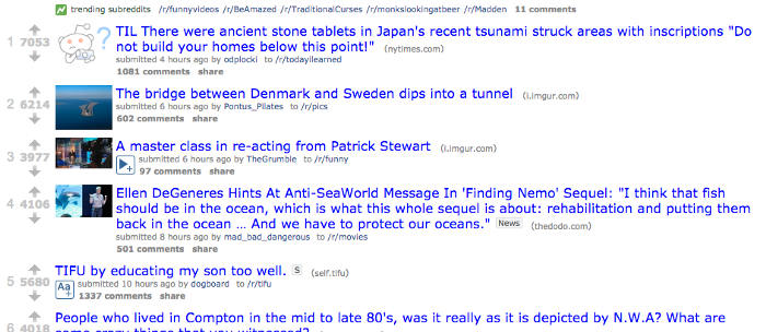
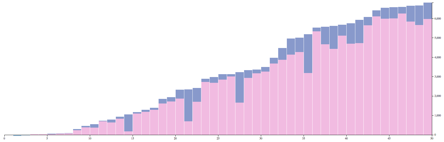
I knew that I could get a few things just from the homepage. I decided to make a graph comparing the amount of likes a particular post gets to the amount of comments. It’s not super insightful, but it gave me something to work with. Here is the scraper that I came up with.
const Xray = require('x-ray');
const x = new Xray();

x('http://www.reddit.com', '#siteTable .thing', [{
  name: 'a.title',
  likes: '.score.likes',
  comments: '.comments'
}])
.paginate('.nextprev a@href')
.limit(2)
.write('./scripts/flare.json');
Because we setup our package.json this way, you would run the scrape with this.
$ npm run scrapeX-ray is just looking for jQuery-style DOM elements. I just inspected the page searching out the data that I wanted to grab. Each story is in the #siteTable div under a “thing” class. Inside of each story lives the data that I wanted to grab. In this case it was the title of the story, the amount of likes, and the number of comments.
X-ray also lets you click a “next page” button and set an overall limit on the amount of times that you want to do this. After all of this, it spits out a JSON file with the key value pairs that you setup above.
[

  {
    "name": "Chinese troops head to border with North Korea",
    "likes": "5198",
    "comments": "1496 comments"
  },
  {
    "name": "TIL that tapes revealed that Enron shut down a power station in California and created an artificial power shortage, deliberately aggravating the 2001 California Energy Crisis, so they could raise prices and cost residents billions in surcharges.",
    "likes": "7403",
    "comments": "1527 comments"
  },
  {
    "name": "Florida man has a heart attack while mowing lawn. These firefighters stayed behind to finish the job.",
    "likes": "6677",
    "comments": "470 comments"
  },
  {
    "name": "FML!",
    "likes": "7244",
    "comments": "1035 comments"
  },
  ...
]
Now comes the actual graph itself. I went through a couple of variations of this, including a very beautiful (and basically useless) bubble graph. I ultimately decided that this data would be best represented with a bar graph (histogram). I wanted the comments and the likes to overlay each other. I cheated a little in just assuming that the amount of likes would always be larger than the comments, but you could solve for that with some extra code. The titles were a bit long, so I decided that they should display on mouseover (a title tag).
Here is where the magic happens. It’s long, but be patient with me. We can walk through it together. Everything is also commented to help give some context. You are commenting your code right?!
const margin = { top: 10, right: 60, bottom: 30, left: 60 };
const width = 1200 - margin.left - margin.right;
const height = 600 - margin.top - margin.bottom;

// Scales the values to the actual height of the histogram
function scaleNumberToHeight(val, valMax) {
  return ((val / valMax) * height).toFixed();
}

d3.json("./scripts/flare.json", function (error, root) {

  var children = root,
    childrenLength = children.length,
    commentsMax,
    likesMax,
    xAxis,
    yAxis,
    x, y,
    data,
    svg,
    bar;

  // Turn strings in to numbers where needed. Set value to zero if nothing found.
  children.forEach(function (data) {
    data.name = data.name;
    data.likes = +data.likes || 0;
    data.comments = data.comments.split(' ')[0];
    data.comments = +data.comments || 0;
  });

  // Grab the max values from comments and likes
  commentsMax = d3.max(children, function (d) { return d.comments; }),
    likesMax = d3.max(children, function (d) { return d.likes; });

  // Set the X Axis to be equal to the amount of children
  x = d3.scale.linear()
    .domain([0, childrenLength])
    .range([0, width]);

  // Set the Y Axis to be equal to the maximum number of likes
  y = d3.scale.linear()
    .domain([0, likesMax])
    .range([height, 0]);

  // Generate a histogram with evenly spaced bins
  data = d3.layout.histogram()
    .bins(x.ticks(childrenLength))
    (children);

  xAxis = d3.svg.axis()
    .scale(x)
    .orient("bottom");

  yAxis = d3.svg.axis()
    .scale(y)
    .orient("right");

  // Create the graph container
  svg = d3.select("body").append("svg")
    .attr("width", width + margin.left + margin.right)
    .attr("height", height + margin.top + margin.bottom)
    .append("g")
    .attr("transform", "translate(" + margin.left + "," + margin.top + ")");

  // Sort list in ascending order based on number of likes
  children.sort(function (a, b) { return d3.ascending(a.likes, b.likes); });

  // Setup the bar data. Offset the top against the height
  bar = svg.selectAll(".bar")
    .data(data)
    .enter()
    .append("g")
    .attr("class", "bar")
    .attr("transform", function (d, index) {
      return "translate(" + x(d.x) + "," +
        (height - (scaleNumberToHeight(children[index].likes, likesMax))) + ")";
    });

  // Add title for hoverable description
  bar.append("title")
    .text(function (d, index) { return children[index].name });

  // Create the likes bar
  bar.append("rect")
    .attr("class", "likes")
    .attr("x", 1)
    .attr("y", 0)
    .attr("width", x(data[0].dx) - 1)
    .attr("height", function (d, index) {
      return scaleNumberToHeight(children[index].likes, likesMax);
    });

  // Create the comments bar
  bar.append("rect")
    .attr("class", "comments")
    .attr("x", 1)
    .attr("y", 0)
    .attr("width", x(data[0].dx) - 1)
    .attr("height", function (d, index) {
      return scaleNumberToHeight(children[index].comments, likesMax);
    });

  // Create the X Axis
  svg.append("g")
    .attr("class", "x axis")
    .attr("transform", "translate(0," + height + ")")
    .call(xAxis);

  // Create the Y Axis
  svg.append("g")
    .attr("class", "y axis")
    .attr("transform", "translate(" + width + ", 0)")
    .call(yAxis)
    .selectAll("g")
    .filter(function (comments) { return !comments; })
    .classed("zero", true);
});
At the top, we are setting an object with all of our major values for the SVG. At the top, they are easy to edit in the future if we need the graph a different size.
Right below that I’ve set a function that takes either of our two types of values (likes and comments), each of their maximum values, and calculates them against the height we’ve set for our scale above.
Then we call the d3.json function in order to parse the values of our flare.json. This will give us access to d3's extensive API for playing with the data.
d3.json("./scripts/flare.json", function(error, root) {Below the variables, I’m looping through the data and making sure it’s in a format that I want it. The comments specifically are trouble because they have a string with the word “comments”, so I’m stripping that and making sure it’s converted to a real number, not just a string.
children.forEach(function(data) {
  data.name = data.name;
  data.likes = +data.likes || 0;
  data.comments = data.comments.split(' ')[0];
  data.comments = +data.comments || 0;
});
I mentioned the maximum values earlier, well d3 has an easy helper function to grab this value as shown.
commentsMax = d3.max(children, function(d) { return d.comments; }),
likesMax = d3.max(children, function(d) { return d.likes; });
From there, we are building out the x and y axis for our graph using a number of helper functions from the d3 API. This includes d3.scale, d3.layout, and d3.svg.axis.
d3.scale permalink
With the linear scale, you asses your values on a [0–1] scale by default. We are setting it for 0 to the number of children in our data for the X-axis and 0 to the number of maximum “likes” in our data.
x = d3.scale.linear()
    .domain([0, childrenLength])
    .range([0, width]);

y = d3.scale.linear()
    .domain([0, likesMax])
    .range([height, 0])
d3.layout permalink
Layout helps you build your graph visually. There are a number of functions allowing you to stack, sort, and build with your data. There is a lot I still need to learn here, and I’m sure that I could have arranged my code even cleaner. Here we are making sure our graph is evenly spaced based on the amount of children our data has.
data = d3.layout.histogram()
    .bins(x.ticks(childrenLength))
    (children);
d3.svg.axis permalink
The axis function is just a quick way to build out the reference lines and ticks for any given graph. You can do this manually, but save yourself the headache.
xAxis = d3.svg.axis()
    .scale(x)
    .orient("bottom");

yAxis = d3.svg.axis()
    .scale(y)
    .orient("right");
From here, we are building out the graph as a series of SVG elements. Wrapping my head around the math needed for this took me most of the time that I spent on the project. I don’t have any real backgound with data analysis, so this was a fun test.
The last bit is some styling for our graph. Here comes the CSS.
body {
  font-size: 10px;
}

rect,
.axis path,
.axis line {
  shape-rendering: crispEdges;
}

rect {
  fill-opacity: .5;
  fill: #e377c2;
}

rect.comments {
  fill: #1f77b4;
}

.axis path,
.axis line {
  fill: none;
  stroke: #000;
}
You should have something similar to the picture at the top of the post.
I’m heading off to vacation and fresh out of ideas for this blog. Give me a heads up if you want to see anything in particular. It doesn’t have to be Node based.